Groupama
1. Available Data
We have a number of data at our disposal concerning the cyclists of the French team Groupama-FDJ. This data is provided to us by Olivier Mazenot, data scientist within the team. We have had different sets of data, but we will focus on the most recent set from May 11th which concerns a single cyclist for different trips.
In the following table, we visualise the data at our disposal.
| Data | Unit | Description |
|---|---|---|
coureur |
/ |
ID of the cyclist |
activity |
/ |
number of the activity |
time_seconds |
\(s\) |
time elapsed since the start of the trip |
position_lat |
/ |
coordinates of the latitude |
position_long |
/ |
coordinates of the longitude |
distance |
\(m\) |
distance covered |
altitude |
\(m\) |
height above sea level |
speed |
\(m/s\) |
number of meters ridden per second |
power |
\(W\) |
rate at which energy, expressed in terms of work, is used |
heart_rate |
\(bpm\) |
speed at which the heart beats per minute |
cadence |
\(rpm\) |
number of pedal revolutions per minute |
temperature |
\(°C\) |
temperature the cyclist is exposed to |
n_segment |
/ |
temporal segments per activities |
2. Data Selection
The Pulse JSON file allows us to implement the different parameters for the simulations. In order to find out which input value to use for the different parameters, we will make use of the data available to us and of additional documentation.
Air Velocity:
After discussions with Olivier Mazenot, we take as an approximate value for the air velocity the speed which is provided to us as data in our data sets. In fact, we state that in this case the wind speed is zero. Note that this approximation is not valid for high wind speeds.
Ambient Temperature:
We can simply use the temperature data from our data sets.
Atmospheric Pressure:
The input values of this parameter can be calculated as described on the Pulse Parameters Description page. Thus, we will use the altitude values from our data sets.
Clothing Resistance:
Concerning the values of clothing resistance we have no data available in our data sets. So we have to search for reference values and base ourselves on them. Thus, we rely on the following values: [CR1][CR2][CR3]
-
polyester cycling jersey: \(0.05\; clo\)
-
polyester cycling short: \(2/3 \cdot 0.05 = 0.033\; clo\)
-
men’s brief: \(0.04\; clo\)
-
ankle-length athletic socks: \(0.02\; clo\)
-
shoes: \(0.02\; clo\)
-
equestrian helmet: \(0.77\; clo\), thus cycling helmet: \(\approx 0.35\; clo\)
Emissivity:
For emissivity, we will use the reference values [EM]. In fact, the value for human skin is around \(0.97-0.99\). By considering cyclists wearing polyester jerseys, we will reduce this value to \(0.90\).
Mean Radiant Temperature:
In our case, we do not have enough data to explicitly calculate or measure MRT. Therefore, we take the value of the ambient temperature as the MRT.
Relative Humidity:
Relative humidity, dew point temperature and temperature are related to each other. However, we only have data on the temperature, which makes it impossible to calculate the relative humidity. Therefore, we will use reference values to simulate different cases. [RH1][RH2]
Respiration Ambient Temperature:
It can be assumed that the temperature of surrounding air for respiration is the same as the ambient temperature. Thus, we can use the temperature data available to us.
Ambient Gas:
For the composition of air gases, we can take the values mentioned on the Pulse Parameters Description page.
Let’s summarise all this in a table.
| Parameter | Useful Data | Value |
|---|---|---|
Air Velocity |
speed |
dataset values |
Ambient Temperature |
temperature |
dataset values |
Atmospheric Pressure |
altitude |
dataset values |
Clothing Resistance |
/ |
\(0.513\; clo\) |
Emissivity |
/ |
\(0.90\) |
Mean Radiant Temperature |
temperature |
dataset values |
Relative Humidity |
temperature |
reference values |
Respiration Ambient Temperature |
temperature |
dataset values |
Ambient Gas |
/ |
Nitrogen: \(0.7901\) |
3. Modelling & Simulations
We will start to compare the heart rates actually measured during an exercise with the predictions of Pulse. Firstly, we will consider basic environmental conditions at the start of the exercise, and secondly we will use the previous sections to update the environmental data at each time step, which corresponds to the time step used in the calculation of the record percentages achieved, with the data at our disposal.
To run the simulations with Pulse, we need to define exercise intensity values for the cyclist. We will use the record percentages achieved to initialise these values.
3.1. Mean Squared Error (MSE)
In order to have a numerical value of the differences obtained between the different graphs, we will make use of the metric called Mean Squared Error (MSE). It is traditionally used to compare sets of values with their estimates to see if they are accurate or not. In our case, we will use this metric to compare our Pulse predictions with or without environmental impact during the simulations.
Definition:
Mean Squared Error is a model evaluation metric often used with regression models. The mean squared error of a model with respect to a test set is the mean of the squared prediction errors over all instances in the test set. The prediction error is the difference between the true value and the predicted value for an instance. [MSE]
A smaller value of MSE corresponds to a smaller difference between the predictions, while higher values correspond to larger differences. A higher MSE indicates a greater impact of the environment on this parameter.
3.2. Comparison between real data and predictions
These graphs are composed of 3 curves representing the heart rates actually measured, as well as those predicted, with or without environmental impact, by Pulse.
3.2.1. Activity Nr. 2
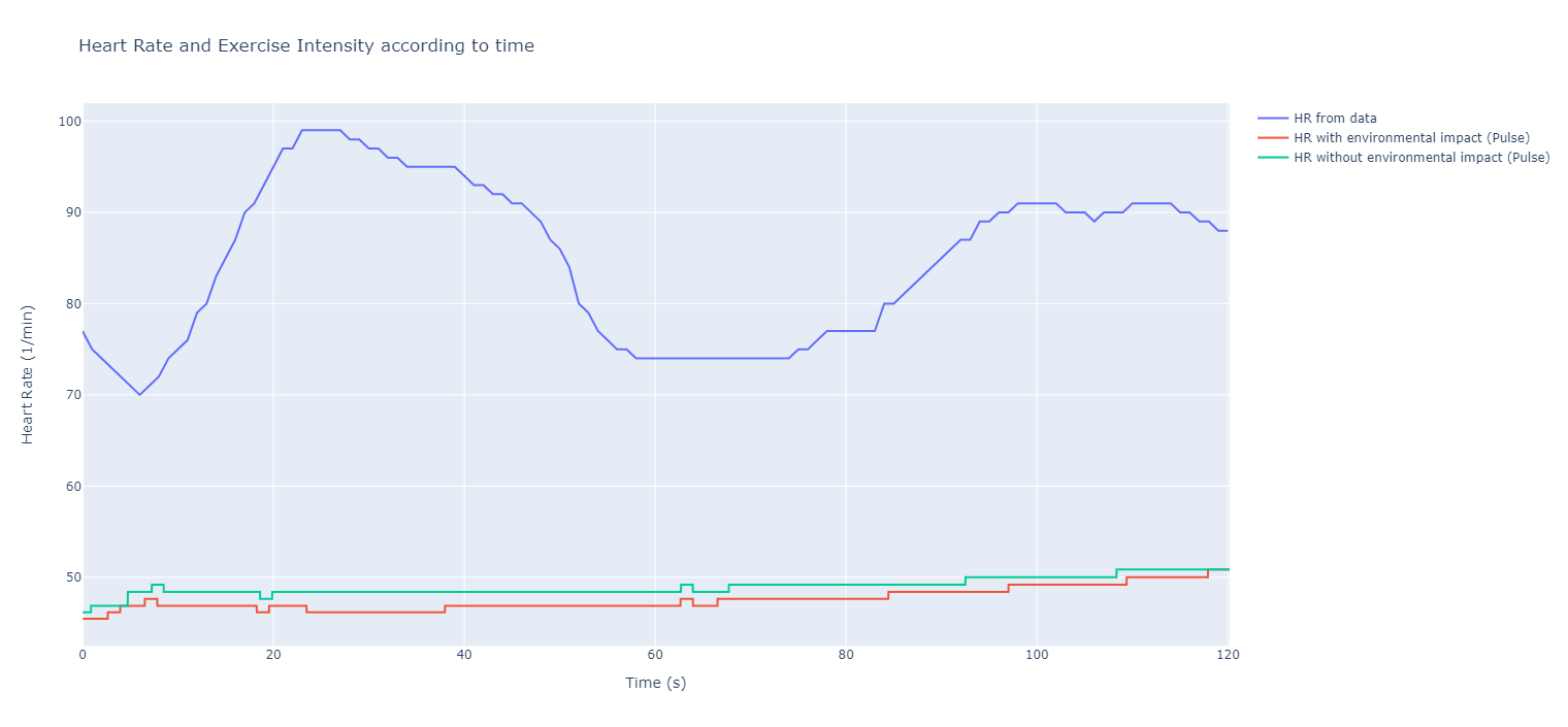
Analysis
It can be seen that the difference between the actual measured data and the Pulse predictions can be enormous as shown in figure 1. Sometimes we end up with heart rates that are twice as high as the simulated ones, for example around \(25\; s\) where the heart rate almost reaches \(100\; bpm\) while the simulated one remains below \(50\; bpm\). My colleague Mélissa Untz explains and analyses this study even more precisely, also with a larger time interval than this one.
It can also be seen that there is a difference depending on the environmental impact. However, in this case, we see that the environmental impact curve is lower than the one without the environmental update, and therefore further away from the real curve.
3.2.2. Activity Nr. 6
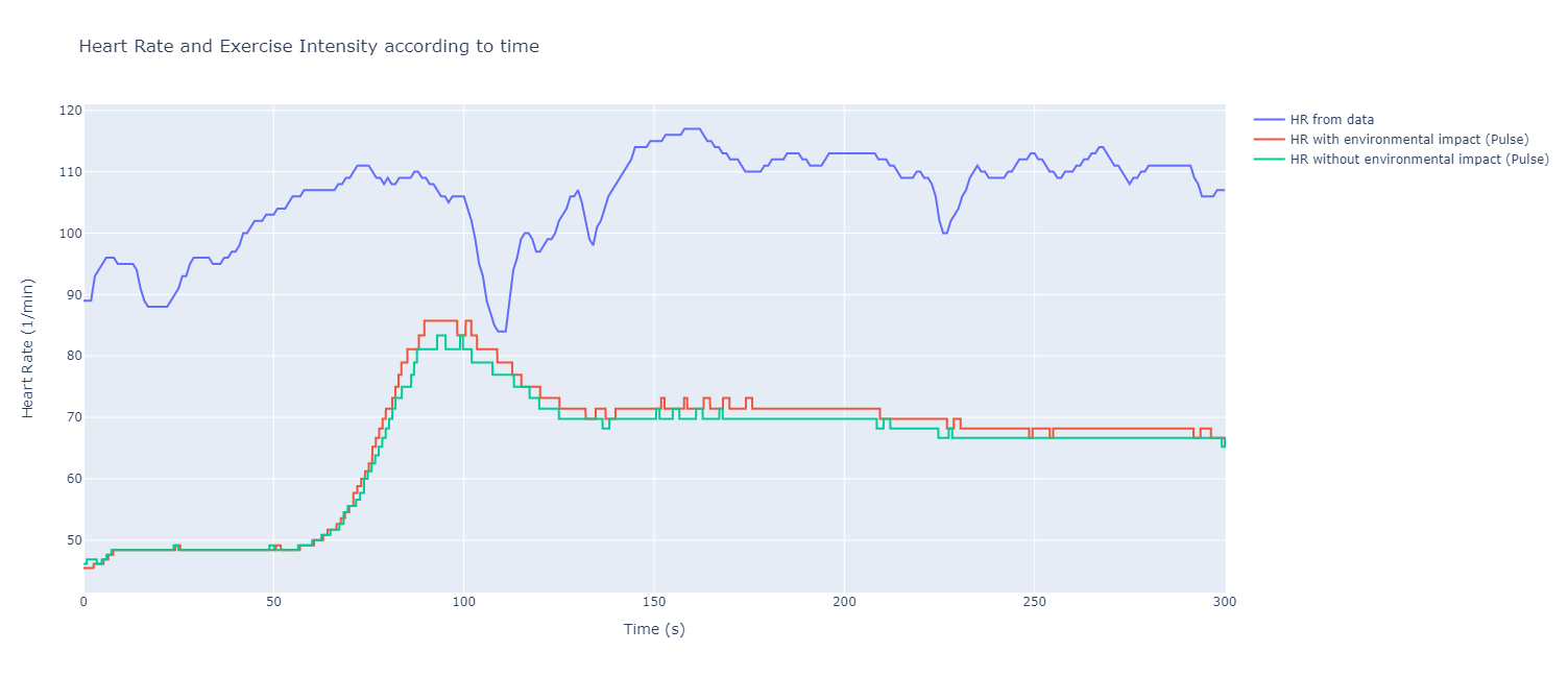
Analysis
For this activity, we notice firstly that the Pulse curves are closer to the real curve than before. The increase of the real curve between \(25\; s\) and \(75\; s\) can be seen on the Pulse curve between \(50\; s\) and \(100\; s\), so with a slight time shift. Similarly, the decrease can be seen just afterwards for all the curves. At the end, we can see that the real curve stabilizes a bit, which can also be seen on the Pulse curve. Even though there are still rises and decreases in the real curve that are not taken into account by Pulse, it can be seen that for this activity the Pulse curves behave more precisely the same like those of the real data. Note that the numerical difference, i.e. the values obtained, remains quite large. For example, at \(50\; s\) the values of the real data are still twice those of Pulse. Moreover, the curve under environmental influence is this time above the one without environmental impact, and thus closer to the real curve.
3.3. Environmental impact on different parameters
In this section, the different graphs will be subdivided into 2 sub-graphs corresponding to the different activities. Each sub-graph contains two curves defined according to whether they are under environmental impact or not.
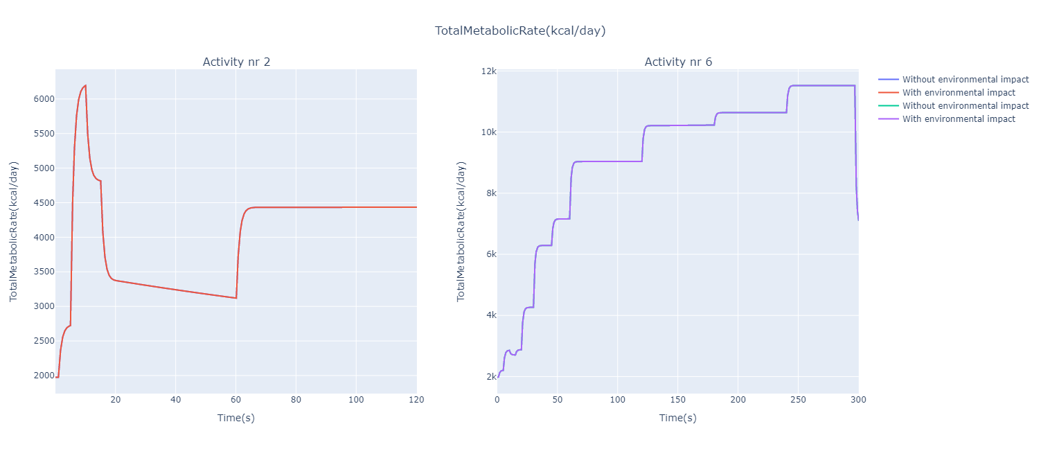
Analysis
It can be seen that the values for the total metabolic rate are quite high as a woman generally needs about \(2000\; kcal/day\) and a man \(2500\; kcal/day\). There is hence a significant energy expenditure by the cyclist, especially for activity Nr. 6. For example, for activity Nr. 2, we can clearly see that the curve descends at \(10\; s\), which is synonymous with a period of reduced intensity, as it is also the case for the heart rate. Also at the end of activity Nr. 6, there is a strong decrease in the total metabolic rate. We can see that for each activity, the environmental impact does not influence the curves (\(MSE=0\)).
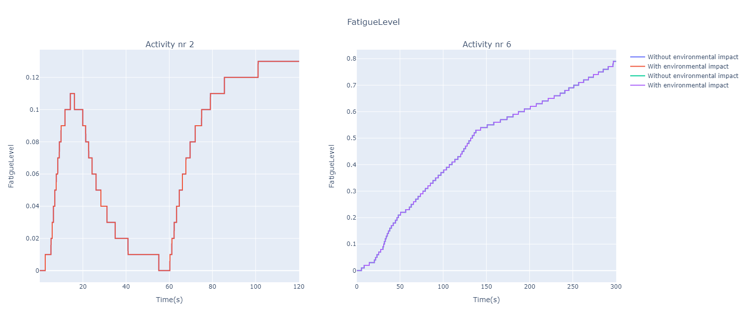
Analysis:
The shapes of the curves are quite similar to those for the total metabolic rate. We can clearly see the moment of reduction in intensity for activity Nr. 2 and a curve that increases constantly for activity Nr. 6. As in the previous graphs, we can see much higher values for activity Nr. 6, which is therefore really tiring for the cyclist. Again, for each activity the 2 curves coincide (\(MSE=0\)) and therefore no environmental influence for this parameter.
Analysis:
This time there is a clear difference between the different curves even though the MSE values remain reasonably small. However, it can be clearly seen that the difference between the two curves increases with time, so the MSE values could probably increase with a longer time interval. For both activities, the curve representing the conditions under environmental impact decreases almost linearly while the other curve increases, and for activity Nr. 6 it remains stable at the end with even a downward trend.
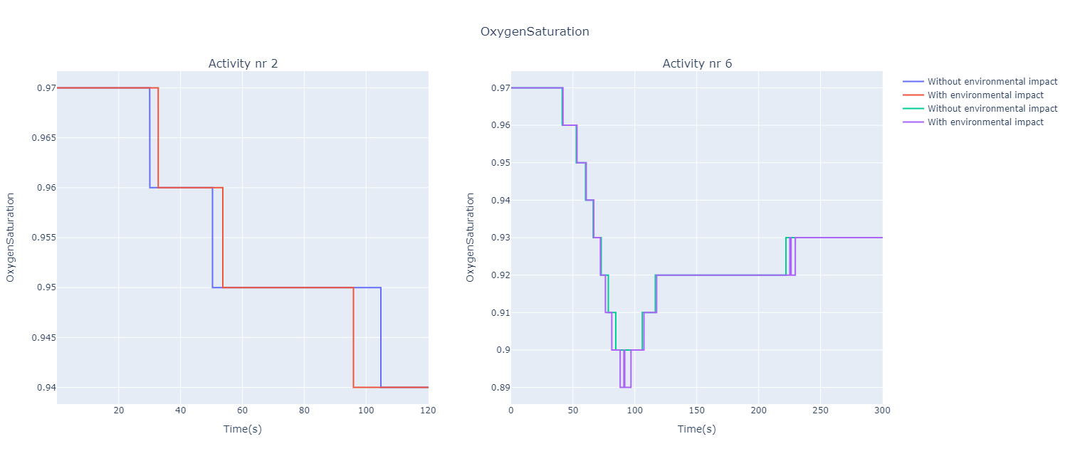
Analysis:
It can be seen that the oxygen saturation starts to drop from the beginning of the exercise. Especially for activity Nr. 6, it falls to \(89%\), knowing that percentages between \(100%\) and \(95%\) are considered as normal, between \(92%\) and \(88%\) we talk about low but still safe percentages, while below \(88%\) we talk about hypoxemia which is dangerous for the health. When performing Pulse, the term hypoxia is sometimes used: "Patient has Hypoxia" which means that the patient has a low oxygen content in his body tissues. [HX]
Analysis:
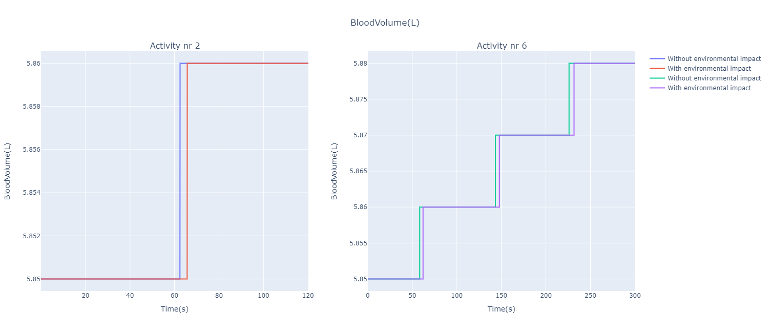
For both activities, we see that the volume of blood increases in a zigzag pattern. The only difference is that the volume of the cyclist under environmental impact starts to increase a little later than the other. Nevertheless, in this case we get an MSE that is very small.
Analysis:
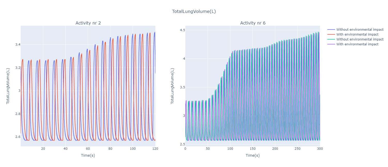
For activity Nr. 2, there is a slight increase in total lung volume over time. For the activity Nr. 6, we notice a big peak between \(50\; s\) and \(100\; s\), which we could also analyse for the heart rates. Again, the volume is constantly increasing.
Analysis:
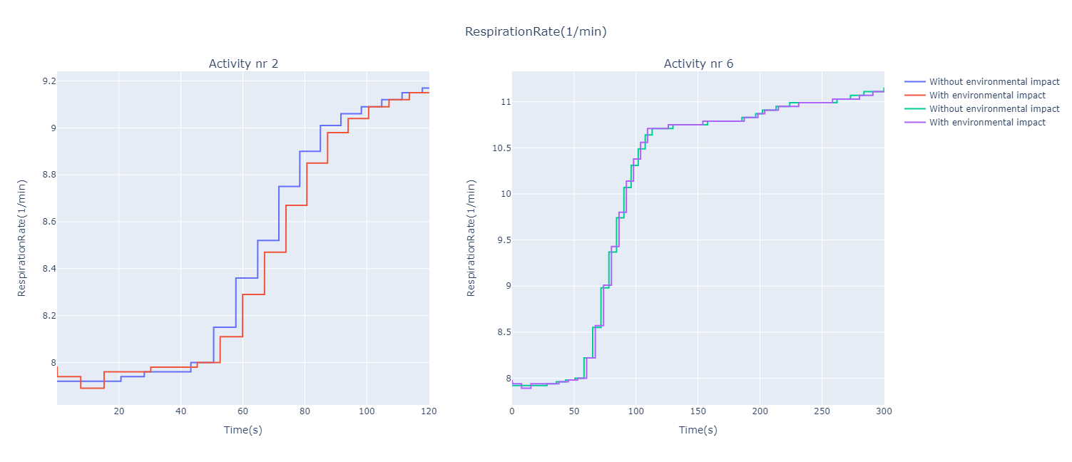
Again, the peak is clearly visible between \(50\; s\) and \(100\; s\) for activity Nr. 6. Similarly, the respiration rates both increase over time, with no significant influence from the environmental impact.
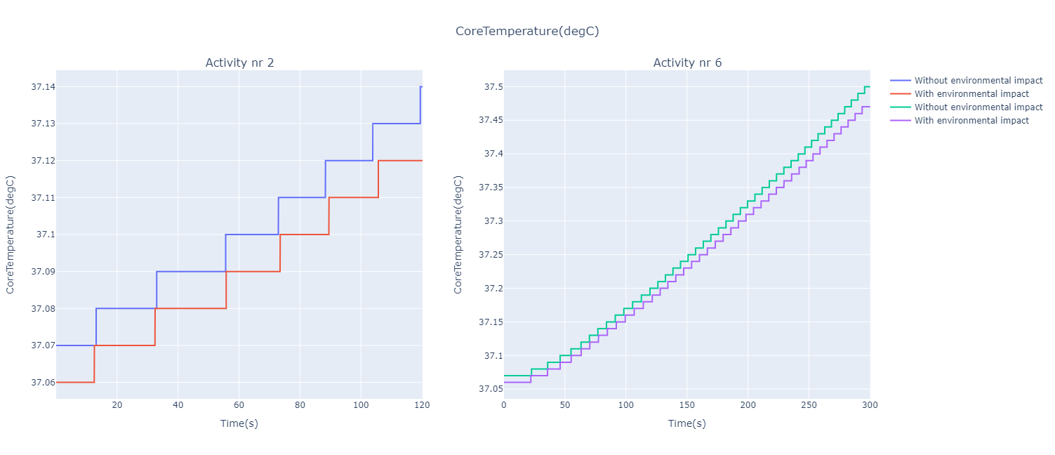
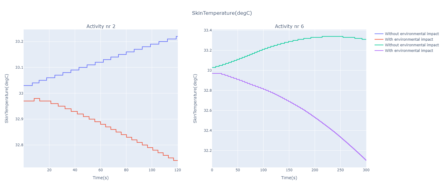
Analysis:
The core temperature increases almost linearly over time. We can see a difference between the curves according to the environmental impact, but when looking at the scale of values, we can see that the difference is very slight, which is confirmed by a MSE that is very small.
For both activities, the conditions are considered normal (\(36.5°C\; - \; 37.5°C\)), while for activity Nr. 6 it is observed that the body temperature approaches a level above \(37.5°C\) (hyperthermia). Overheating, also known as hyperthermia, consists of producing or absorbing more heat than can be dissipated. [HT]
Analysis:
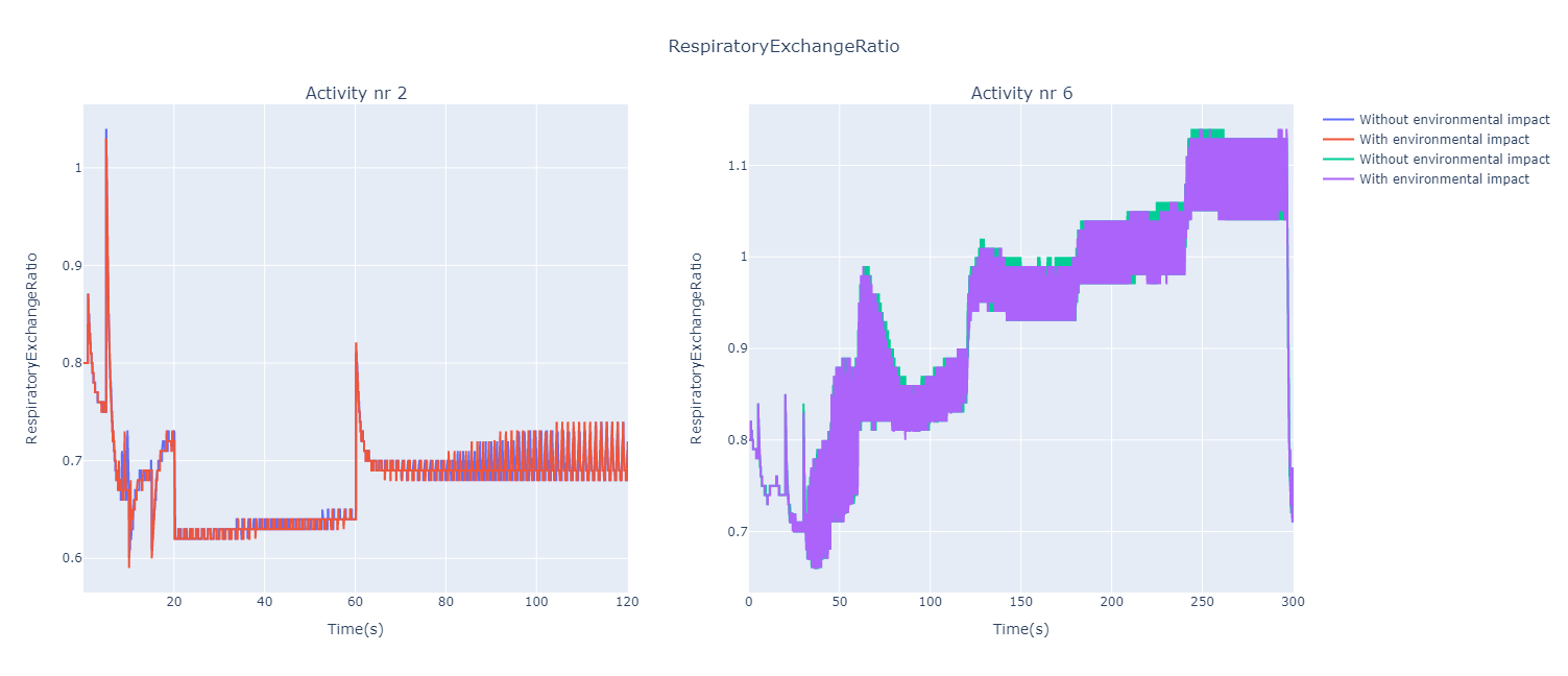
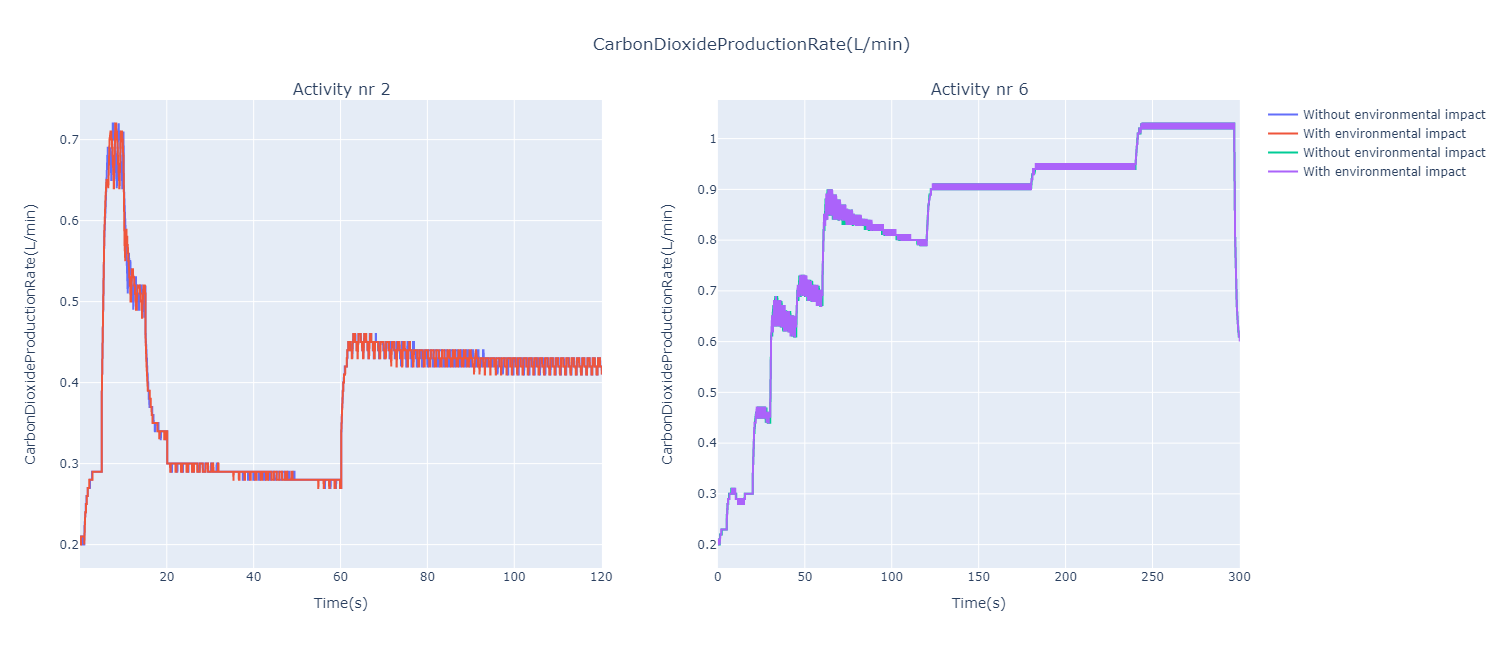
The respiratory exchange ratio represents the ratio between the amount of carbon dioxide production and oxygen consumption. The Nr. 2 activity shows everywhere, except at about \(5\; s\), a ratio \(<1\), i.e. a higher oxygen consumption than carbon dioxide production. However, the Nr. 6 activity shows ratios constantly \(>1\) from about \(180\; s\), thus an increased production of carbon dioxide, with even slightly higher ratios without the environmental impact. At the end, we observe an extreme decrease in the ratio which is related to our previous observations for this activity.
Analysis:
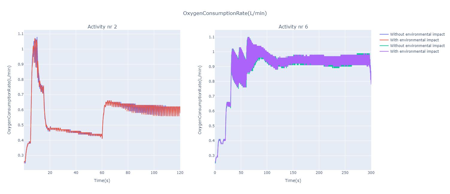
For the activity Nr. 2, we notice that the curve strongly resembles the one obtained for the heart rates. This can also be seen for activity Nr. 6, but a little less clearly. It can therefore be deduced that there is a link between heart rate and oxygen consumption. We even see slightly lower ratios for the simulations without environmental impact, even though the MSE is still very close to \(0\).
Analysis:
The same observation can be made concerning the similarity of the curves with those for heart rate, with an even stronger similarity for activity No. 6. Moreover, the significant drop at the end of the activity is even more clearly visible. The curves are also generally "thinner" than those previously shown for oxygen consumption. Here again we can deduce that there is a connection between the production of carbon dioxide and the heart rate.
Analysis:
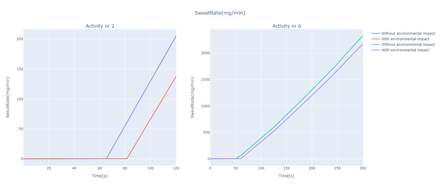
This is the parameter with the biggest difference according to the environmental impact, which can be clearly seen with the MSE values: \(1.487 \times 10^3\) and \(8.475 \times 10^3\) for activity Nr. 2, and Nr. 6 respectively. First of all, it can be seen that the cyclist under environmental impact starts sweating later. Nevertheless, the two curves grow almost in parallel, but thus the cyclist exposed to standard environmental conditions reaches higher sweat rate values faster than the cyclist with a dynamic environment. It can be deduced that this is the parameter in our study that is most strongly influenced by the environmental impact.
3.3.1. MSE Values
The following table shows and recaps the values obtained for the different figures.
| Parameter | Value (Activity Nr. 2) | Value (Activity Nr. 6) | Figure Nr. |
|---|---|---|---|
Heart Rate |
\(2.186 \times 10^{0}\) |
\(3.237 \times 10^{0}\) |
1 & 2 |
Total Metabolic Rate |
\(0\) |
\(0\) |
3 |
Fatigue Level |
\(0\) |
\(0\) |
4 |
Skin Temperature |
\(7.742 \times 10^{-2}\) |
\(4.806 \times 10^{-1}\) |
5 |
Oxygen Saturation |
\(1.245 \times 10^{-5}\) |
\(8.467 \times 10^{-6}\) |
6 |
Blood Volume |
\(2.696 \times 10^{-6}\) |
\(4.616 \times 10^{-6}\) |
7 |
Total Lung Volume |
\(2.696 \times 10^{-1}\) |
\(9.491 \times 10^{-1}\) |
8 |
Respiration Rate |
\(6.663 \times 10^{-3}\) |
\(5.202 \times 10^{-3}\) |
9 |
Core Temperature |
\(1.102 \times 10^{-4}\) |
\(2.868 \times 10^{-4}\) |
10 |
Respiratory Exchange Ratio |
\(1.487 \times 10^{-4}\) |
\(1.611 \times 10^{-3}\) |
11 |
Oxygen Consumption Rate |
\(5.134 \times 10^{-4}\) |
\(2.723 \times 10^{-3}\) |
12 |
Carbon Dioxide Production Rate |
\(1.496 \times 10^{-4}\) |
\(1.246 \times 10^{-4}\) |
13 |
Sweat Rate |
\(1.487 \times 10^{3}\) |
\(8.475 \times 10^{3}\) |
14 |
References
-
[CR1] Wikipedia (2021, June 24). Clothing insulation. Retrieved from en.wikipedia.org/wiki/Clothing_insulation.
-
[CR2] ResearchGate (2021, June 24). Assessment of thermal comfort of nanosilver-treated functional sportswear fabrics using a dynamic thermal model with human/clothing/environmental factors. Retrieved from researchgate.net.
-
[CR3] ResearchGate (2021, June 24). Biophysics of Heat Exchange and Clothing: Applications to Sports Physiology. Retrieved from researchgate.net.
-
[EM] Wikipedia (2021, June 25). Emissivity. Retrieved from wikipedia.org/wiki/Emissivity.
-
[RH1] Wikipedia (2021, June 28). Dew point. Retrieved from en.wikipedia.org/wiki/Dew_point.
-
[RH2] Energie+ (2021, July 5). Confort thermique: généralité. Retrieved from energieplus-lesite.be/theories/confort11/le-confort-thermique-d1/.
-
[MSE] (2011) Mean Squared Error. In: Sammut C., Webb G.I. (eds) Encyclopedia of Machine Learning. Springer, Boston, MA. https://doi.org/10.1007/978-0-387-30164-8_528
-
[HX] A1ADSupport (2021, July 22). What is a normal oxygen level?. Retrieved from a1adsupport.com/what-is-a-normal-oxygen-level/.
-
[HT] Wikipedia (2021, July 23). Human body temperature. Retrieved from en.wikipedia.org/wiki/Human_body_temperature.